Delivering value & reducing risk
Published on 14/07/2020
The question: “How can we reduce risk and deliver value at the same time?” resonates with an increasing very-related question: “How can we meet infinite growth in a finite world?”. Let’s see how we did our best on our team’s scope to answer this question. Onboard with us on a two and half months journey mostly during covid-19 confinement.

Value VS Risk
Every journey is a compromise between value and risk. Each individual has his own evaluation grid and decides to travel or not. And pretty much any decision in life is about making tradeoffs between risk and value. Products do not escape this rule.
Everyone has a definition of what value is. But people tend to agree that it is the importance, worth, or usefulness of something. When worth or usefulness are accepted to be defined by the market, importance is mostly internal and is the last key to prioritization.
Here the title mentions risk when actually most people talk about debt (especially technical debt). I personally don’t believe in technical debt. Debt does not exist on technical products. It is actually more of a risk, high or low. Every time a developer removes a line of code and replaces it by something better, we don’t reduce debt (we have no contract with anyone mentioning a quantifiable debit), we reduce risk. If the topic interests you, I recommend you read: “ The Myth at the Heart of the IT Labyrinth”.
When you travel, it is for a reason. You want to go somewhere, have a break, see landscapes, find yourself... but you can’t do all at once. When you build a product, you may very often want to seduce new users, limit churn and reduce costs but doing all three at once is difficult. There is a high chance that you will focus on only one.
Delivering value and reducing risk are very often presented as opposed tasks. Reducing risk is never perceived as adding value. Naturally, Humans want more. Even if it puts them in a debt situation. We unconsciously apply this behaviour to any (tech) product in hopes for later growth ; at least enough growth to catch-up and overpass the debt.

Every context is unique
AB Tasty helps its clients to de-risk decisions and leverage growth potentials.
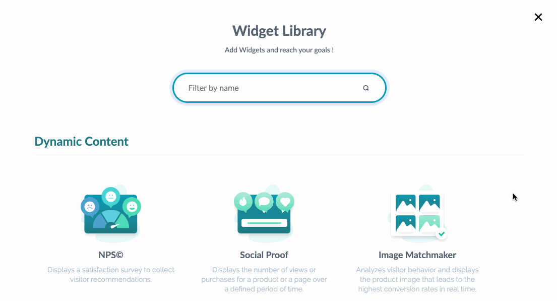
We offer different ways to do so. One of them is to use widgets.
For our users, widgets are a collection of easy-to-deal-with tools. Some can help you to quickly add a banner or a modal onto a page, some can display a countdown and others, more sophisticated, can display an NPS survey.
For us, widgets are a way to distribute value and to cover a Pareto of user needs. They look friendly and they also speed up our service of custom development: what cannot be done with a widget only is done faster with a widget and custom development.
They have been, for a long time, a very impactful and differentiating way to deliver value, with minimum efforts, to our users. Competitors are aware of that and are joining us in the game. The rise of code-less widgets goes in pair with the no-code movement, the need for marketers empowerment and the fast iteration loop progress in organizations.
The widget gallery has seen its volume increase over time and new ones have seen light from time to time.
Back in November, there was both an increasing need for new widgets (internally and externally) and a growing pile of issues on the existing ones. I had the chance to join AB Tasty in November and work in a team where the level of experience dealing with widgets is high. They quickly explained to me the main points on which the widgets were relying. The structure of the use of a widget relies on four pillars: layout, content, style and conditions. Before you know it, you start to think like the people in the company and things like these four concepts sound familiar. Nevertheless, for the new user, it never is that obvious. Let’s dig into details before we go further.
- Layout: this tab helps you to give a global shape of your widget and place it in the page.
- Content: in this tab, you will decide if it will have a button or not and if the text is going to be long or short, if it will have an image...
- Style: this is where you decide about how your widget will look: colors, borders, backgrounds...
- Conditions: this tab defines under which conditions the widget will be triggered (displayed) and when it will be re-triggered (or not). In short, how the widget will behave in relation with the visitor behavior.
The more we discussed with the team about bug tickets, feedbacks, the more we discovered that widget components, behaviours and usability needed to be more consistent. This consistency would help users reduce their learning curve and become more and more familiar with the widget logic. It would also reduce what some people call “user problems” - which is a fancy way to say that a product is unclear enough to mislead users. Little by little, we started to call the components by names: “the select element”, “the color picker”, “the slider”... and started re-designing every single one of them.
So you have widgets, inside each widget, you have tabs, and inside each tab, you have components, inside each component, you have a whole load of complexity. All alike but all different. Not to mention that there is no such thing as two identical websites and that we make our best to be compatible with them all.
That moment reminded me a conference from Roy Tomeij in 2012 (yeah, I’m old) on design systems and how Bob Ross (yeah, I’m that old) was reusing components (“the happy little tree”, “the quiet river”, “the almighty mountain”...) the same we used to start with design systems.
I’m not even sure we were using the words “design system” back then (Dieter Rams probably was). In the conference, Roy mentions “pattern design” if I’m correct. This is globally the same idea: re-use all the things.
Once we had redesigned the bricks and given them names, we had to replace every brick in the wall without removing the wall. Mortar being: time, patience & side effects.
Preparation to somewhere
With a database extract of all widget configurations existing among our 600,000 campaigns, It gave us a clear global view of the mostly used widgets, the most growing ones in use, the percentage of default values being used and the values that were pushed to extreme limits or even the ones overridden with extra code. We also made a 100 slides presentation listing all the inconsistencies, misplaced components, bad wording, weirdities...
The thing we missed was a use-tracking map. The database extract gives an image of the latest saved version of each widget but does not tell you much about: the average number of times the settings of a widget are changed, how many clicks on a component are required in average to make a single change, do users change this before that,... So, a good advice would be to track all the use of your new product (probably not on an MVP). You may need it afterwards. Same here, it is not an investment. It is reducing future potential risks.
When you know you go North or South, for a week or a whole year, you pack accordingly. The bad (or probably good) thing with Agility is that you don’t really know your destination. You know where you’re gonna sleep the very first night. When you are there, you can watch behind you and frounce if you did not do much or pat your back and congratulate yourself if you consider your stride was good.
By the way, I strongly recommend you to watch Dave Thomas talk below:
We knew that the duration of the journey was going to be hard to estimate as we had to maintain in operational conditions the existing widgets and replace pieces which hold them up. We decided to start with the most common component of all: the text input. The text input was the simplest component (and by chance the most common and used one among the widgets). By redeveloping it, we could then know how long the others could take us to re-develop and the difficulties we could meet along the way.
Oh boy, we shortly understood that such a “simple” component like that was tied up with lots of different issues: translation management, validation logic, error triggering, types, conditions, statuses... So instead of re-doing the components and replacing them into the existing widgets, we discovered that we also had to rebuild the foundations.
Mockuping everything before the development starts is not so much Agile and much more Waterfall. We however mocked up all screens of all widgets. Doing so took a bit of time but also came with benefits:
- Overview of all the work to be done
- Re-usability ratio of each component
- Potential conflicts list
- Missing components list
- Communication prep work list
We decided to do it in milestones: first set foundations, then redo components, finally implement components and rework existing widgets.

A new widget
When you trek, it is always better to start your day looking at the map, seeing the contour lines, the passes, the valleys, the waterfalls, the swamps, the places where it is safe to rest... so it mentally helps you to manage your efforts along the way.
The idea of rework all widgets was, more than anything else, to put AB Tasty in a position to deliver new widgets faster. Way faster. Nevertheless, the need for new widgets was so strong that we had to deliver a new one as soon as possible. Delivering a new widget was the best proof we could provide to demonstrate that our work was meeting our commitment: put the company in a position to deliver new widgets faster.
Which one though? We have a lot of new widget ideas in the backlog. We needed to pick one that was simple, visual and desired. We decided to ask client-facing functions of the company which was the most desired/expected widget from our clients/prospects.
The reply was really consensual. Customer support, technical experts, sales development representatives and key account managers were aligned: progress bar.
After a few meetings, we agreed to cover three main desired use cases of progress bar: cart page, word counter and scroll progression and that the edge cases would be covered by writing a custom JavaScript returning a value to update the widget progression.
- Cart page: the widget displays the progression level parsing the subtotal or total value of the cart page in relation to a quantity to reach. For example: ”Only $14.10 to add to your cart to get free shipping.”
- Characters counter: the widget displays the progression of a product review remaining/minimum characters to type. For example: “1,524 / 2,500 minimum chars.”
- Scroll progression: the widget displays how far you’ve scrolled down the page in order to make the visitor understand immediately if the page is a long scroll or not.

The arrival
Sprint after sprint, foundations were stabilized, components redone and widgets reworked. So far, we’ve reworked almost a third of all widgets and launched a new one. New widget creation time has been reduced by 10. Translations are consistent and easily reviewable from different internal and external members. Unit tests have been added to all reworked widgets. A new widget has been delivered.
We still have a lot to do to finish the widget journey but now, we know that we can parallely deliver value and de-risk a functional scope.
When starting a trip, don’t plan too much. Make sure you have a map you can zoom in and out to help you change point of view. Come back alive and a better version of yourself. Adaptation is natural, welcome the unexpected.
Photo credits : Burst - Source, Elliott Chau - Source, Yoann Grange - Source